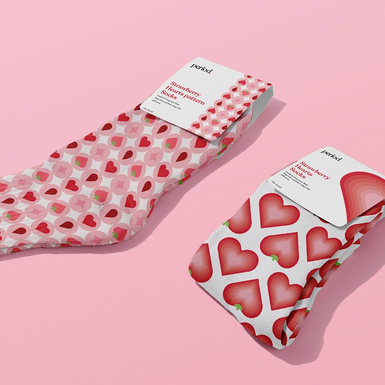
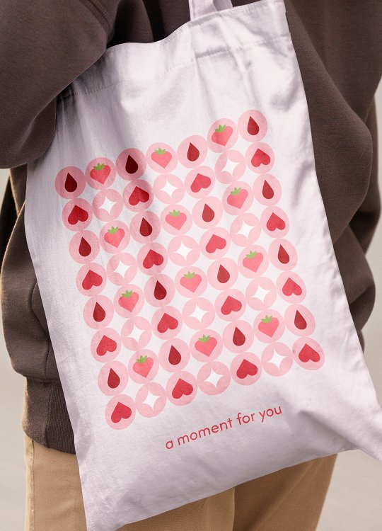
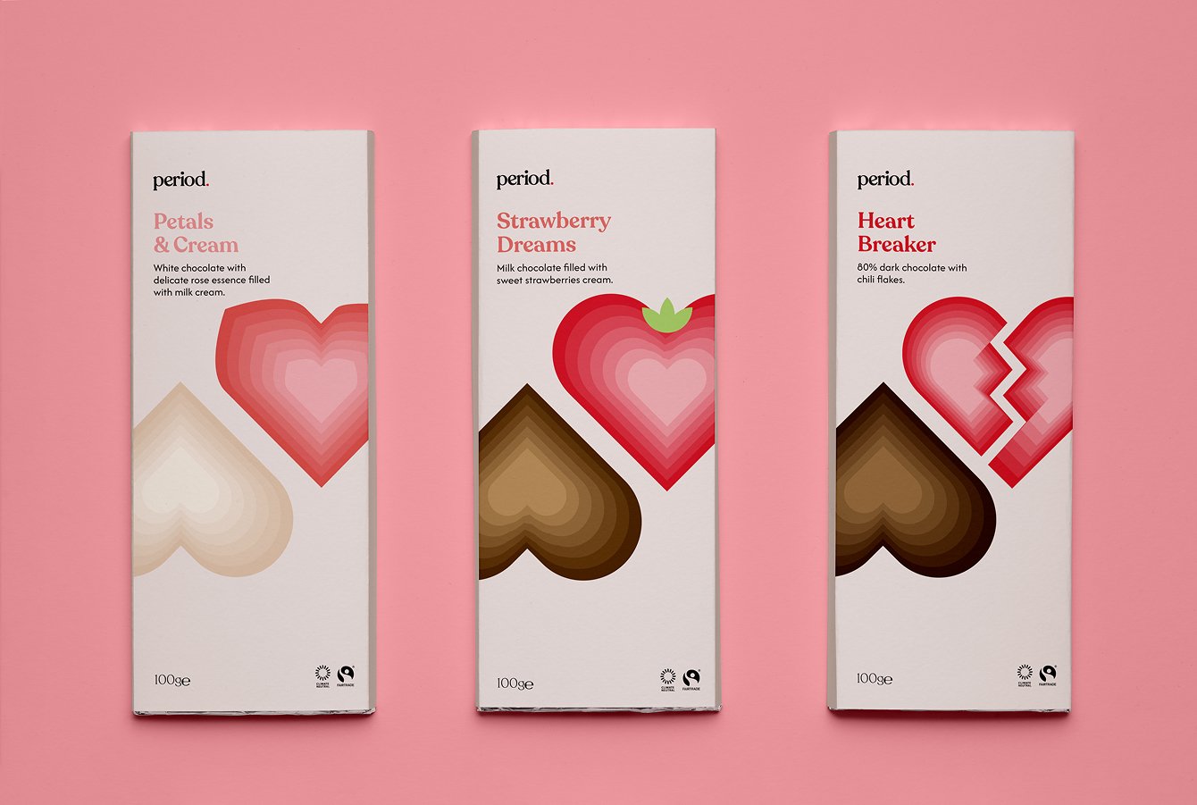
Period. is a brand that understands the moods, the cravings, and the need to pause.
Soft, comforting, and thoughtfully designed, it supports every part of your cycle – with care, calm, and a sweet touch.
Because you deserve to feel good, especially on your hard days.
about the project
Created as part of a school project exploring time, health, and happiness, this project began with a simple question: What makes me unhappy? The answer was clear – my period. From there, I developed period. , a brand built entirely from scratch to address both the physical and emotional needs women experience during their cycle. Over the course of a month and a half, I designed every element – from concept and strategy to packaging and illustration – with one goal in mind: to craft a warm, caring, and feminine space that offers real solutions for our periods.
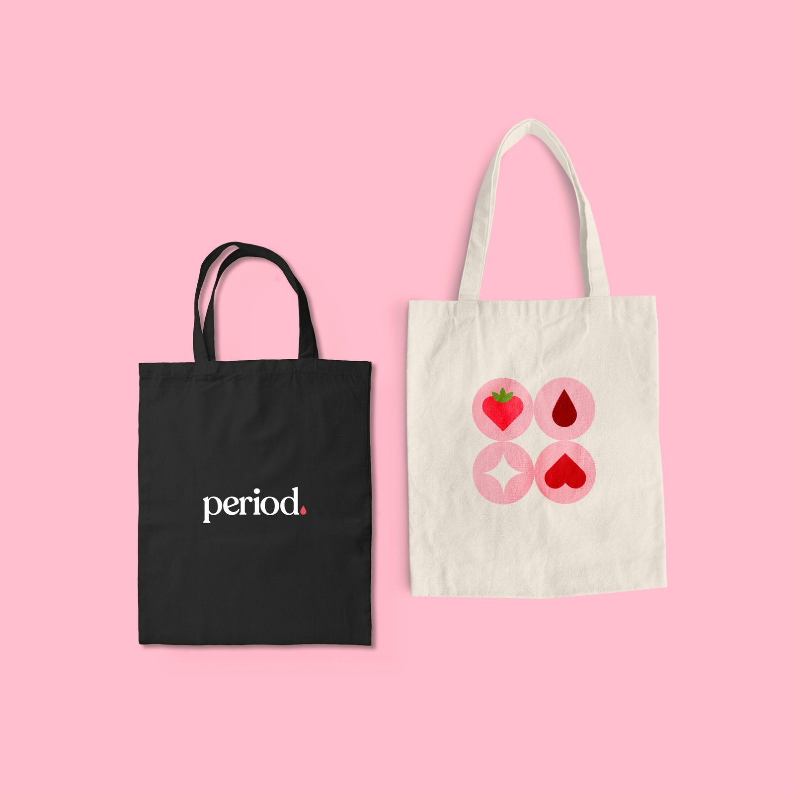
Visual Identity
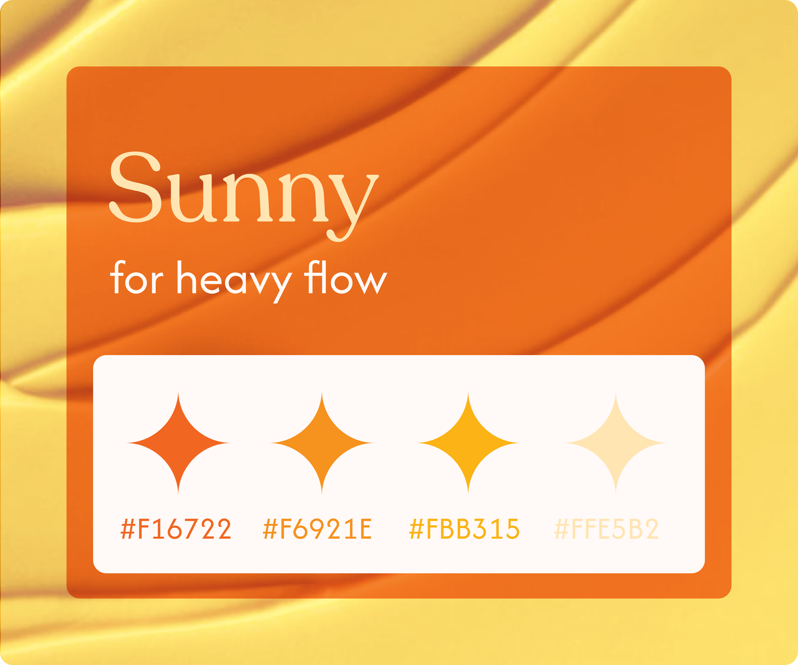
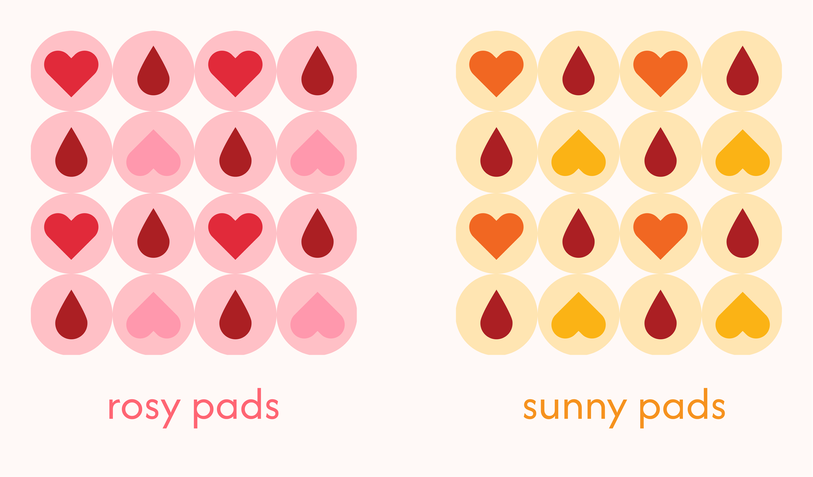
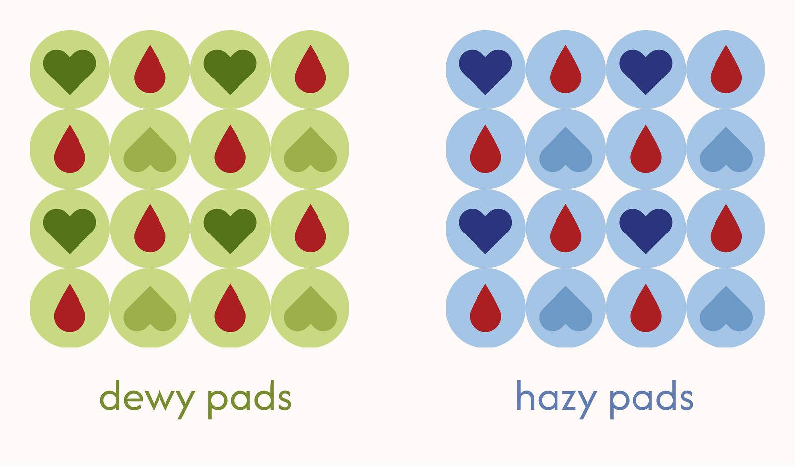
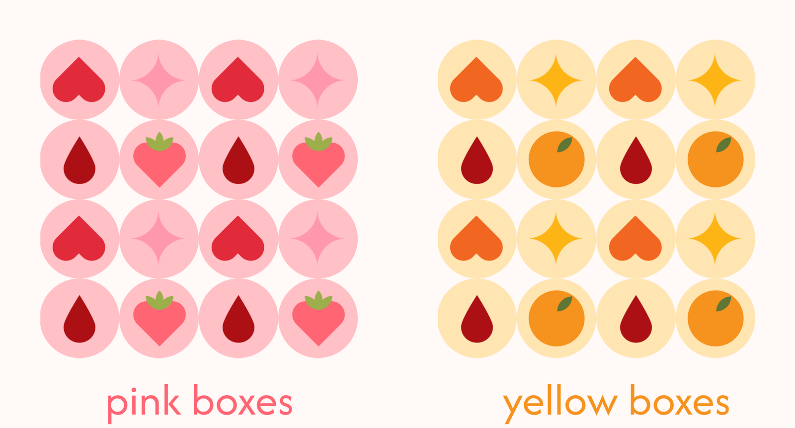
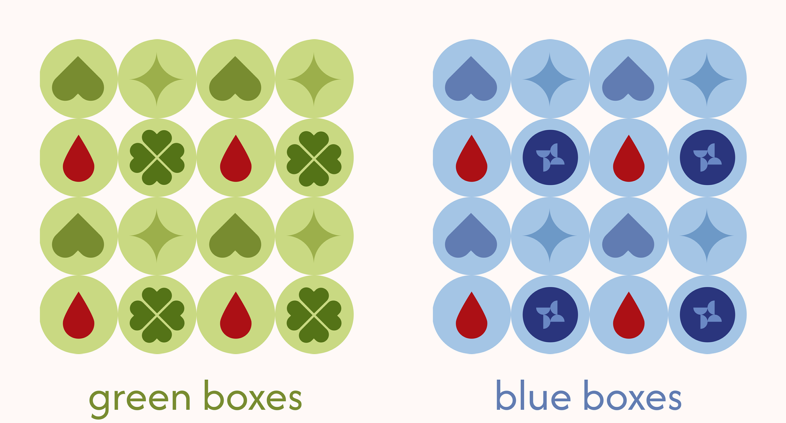
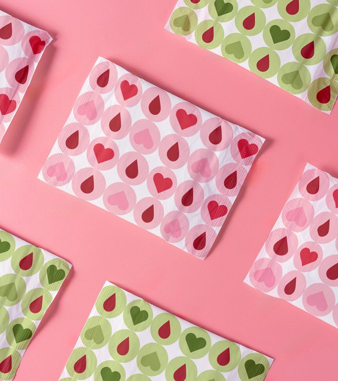
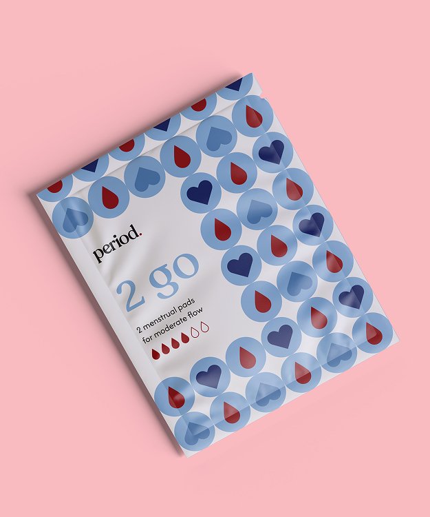
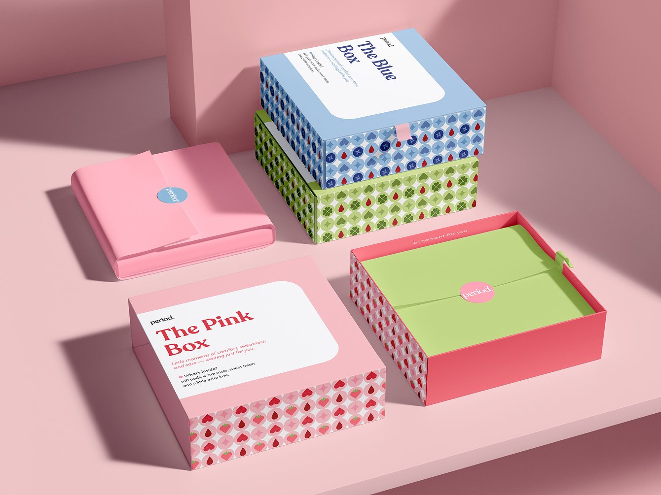
A soft, color – coded system that speaks your cycle’s language – through comforting patterns, calming colors, and thoughtful design.
Typography
The brand uses Recoleta for headlines – a rounded, elegant serif that brings a soft, feminine presence to the identity. For body text and small details, I chose Afacad, a clean and versatile sans-serif that pairs well with others and ensures easy readability across all formats.
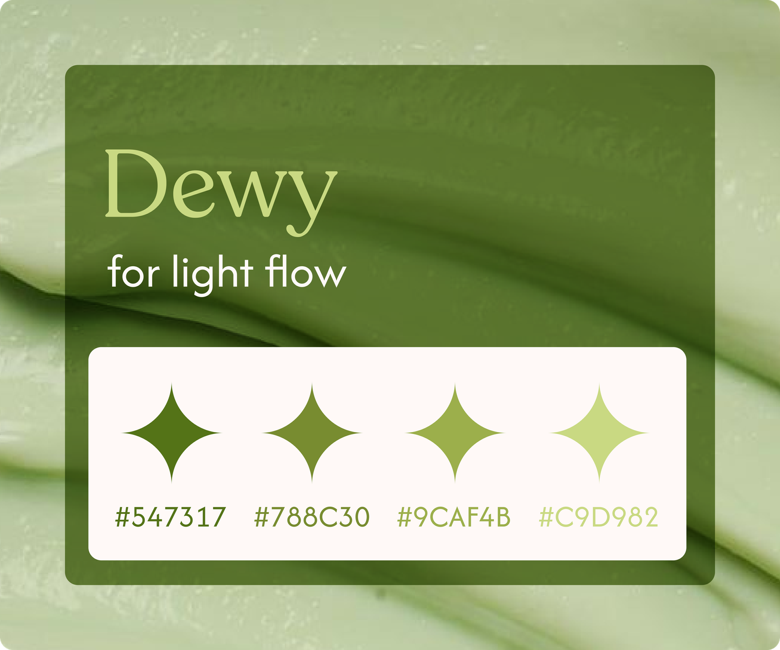
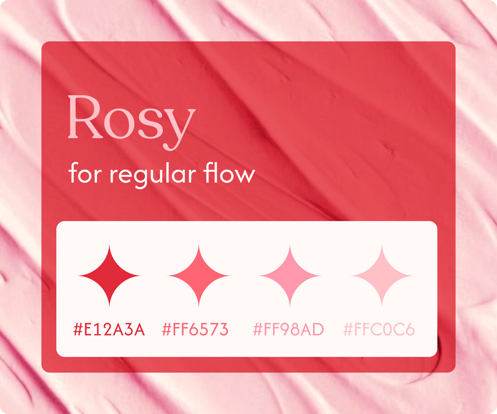
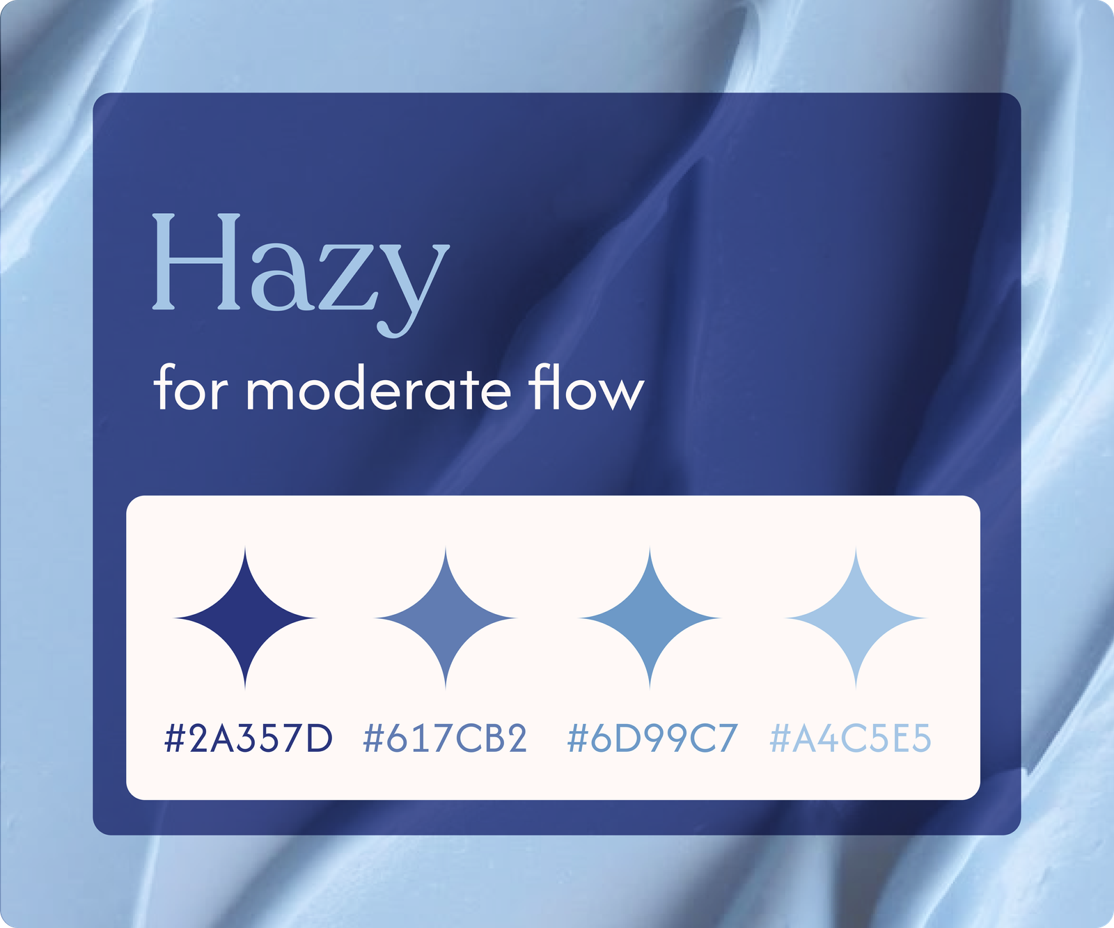
Colour System
Each color reflects a different flow or need – from light days to everything – but – easy ones.